
|
Title: Sparkling Mundanity
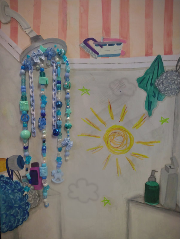
Size: 46 cm X 36 cm Medium: Watercolor & Sculptural Components Completed November - December 2023 - Exhibition Text -Sparkling Mundanity is a watercolor illustration with flowing sculptural components emulating the movement of water. I wanted to capture a mundane scene (the inside of a shower) that not many people may focus on. I think as an artist even the most mundane scenery are able to become something more, like a reflection into a person's identity and how they function. With impressionist inspirations from Van Gogh I was able to achieve this.
|
- Inspiration -

Bedroom in Arles by Van Gogh, 1888
|
Van Gogh is known for his impressionist style, light line work with almost child-like colors. This is prevalent within both pieces Bedroom in Arles these works were part of a series/revision of works. Like Sorrowing Old Man Van Gogh created similar works in order to dabble with said line work and color. This first piece, made in 1888 has a bright rounded color palette. Similarly the shapes are also more rounded, corners appear more softer and less defined. This piece is more simplistic with the way it is able to define its detailing, instead using little areas of texture with thick-to-thin lines that appear somewhat choppy.
I wanted to replicate the overall mundane and simplistic nature of this piece. I find the way art is able to spin a mundane scene very inspiring so replicating this was important. |
|
In comparison to the older piece, this Bedroom in Arles (Version 3) is more like the style people associate with Van Gogh, while the first piece also achieves this Van Gogh style Version 3 is able to be more recognizable. This is done through a constant texture of line and how each aspect of the piece is defined with a thin dark outline. This piece has more definition and as a result it is much more darker as well. The once bright colors of the first piece are now more muddled and realistic.
Like both inspirations I wanted my piece to achieve a blend of both works. Using the darker colors from this piece with more obvious line work would help me. Additionally I wanted my piece to have a similar use of texture to create depth as well. |

Bedroom in Arles, Version 3 by Van Gogh, 1889
|
- Planning -

|
To better understand what I wanted to create I first took a reference photo of one scene within my shower, I wanted to better understand the components within a scene (like the repetition from Van Gogh). After taking this reference photo I drew two of the components from memory to create a rough idea of what I wanted to emphasize within the actual piece. This planning phase overall was a way for me to better understand what I wanted from my chosen medium (watercolor) because I have not worked with them in depth.
As a result of this lack of experience I also experimented with how the watercolors themselves behave under certain circumstances. Whether that be with layering or an amount of water I wanted to evolve the way I used watercolor. Additionally I created a rough shower head with water cascading down, this was because I knew I wanted to create movement within my piece, somewhat similar to the way Van Gogh is able to create overlapping textured in order to create depth within his own work. My planning also allowed me to create a rough idea for my overall color palette (like the practiced components I knew I wanted to create a brighter area with darker shading. |


|
- Process & Experimentation -

|
To better understand the scene I wanted to create I first took a photo of my own shower. Since I rarely worked in watercolors while also rarely creating scenes/backgrounds it was important for me to be accurate with what I was creating. Like my planning I knew I wanted to create a brighter color pallet, similar to Van Gogh's first iteration of Bedroom in Arles. Because of this I knew I was going to transfer the overall layout of my own shower, while creating a brighter scene.
|
Because of the difference in medium I was initially somewhat experimental with my process. My work was broken up into two versions (somewhat like Van Gogh). This was due to the fact that my first version/work in progress of my piece became very muddled and dark.
Within my first version I initially sketched out the reference photos onto an illustration board, tweaking some of the details that would further my juvenile perspective. After creating the sketch I added a light gray wash to the background to make shading certain areas easier. However when I began shading the first version it wasn't necessarily turning out the way I wanted it to. Additionally when working on the top half of this version the perspective did not appear to be the most accurate. However prior to deciding to create another version I attempted to work on the smaller details like the showers loofah and washcloths. And while this version's color was like the reference photo they were too dark, unlike my desired messaging and my inspiration. Because of this as stated above I decided to ditch this experimental version and start over.
Within my first version I initially sketched out the reference photos onto an illustration board, tweaking some of the details that would further my juvenile perspective. After creating the sketch I added a light gray wash to the background to make shading certain areas easier. However when I began shading the first version it wasn't necessarily turning out the way I wanted it to. Additionally when working on the top half of this version the perspective did not appear to be the most accurate. However prior to deciding to create another version I attempted to work on the smaller details like the showers loofah and washcloths. And while this version's color was like the reference photo they were too dark, unlike my desired messaging and my inspiration. Because of this as stated above I decided to ditch this experimental version and start over.

|

|

|

|
I started the process for the second version of my piece similar to the first. After sketching and adding a wash in the background I began to shade in certain areas, however this time I made sure to use a thicker brush to create a more dispersed look. Additionally I created a more pastel color pallet for this version as well. That way less things became muddled while still maintaining contrast. After adding all of the base colors and shading I wanted to emulate the line work/line shading in Van Gogh's works, this can be most seen in the texture of the loofahs and wall. Since I wanted my piece to appear as though the audience is seeing it from a child's perspective I also created sculptural components to emulate the movement of water. Using a variety of blue embellishments and beads creates a high amount of texture within the water, while maintaining something playful. Additionally I utilized oil pastel to create some childish doodles as well.
- Reflection -
This piece was somewhat difficult for me to finish, I have not done much scenery within several of my pieces and as a result having to be more geometric was harder for me. This was also made more difficult due to the difference in medium as well. Using watercolor allowed me to achieve the lighter color and line work I wanted to achieve, however it isn't the most forgiving of mediums (in comparison to acrylic). My overall technique was able to evolve as a result of this piece as well. Because of this I enjoyed creating this work, additionally since I was able to incorporate different aspects of my craft into this piece as well (sculptural) I was able to create something entirely different that my previous works.
- Citations -
“The Bedroom | the Art Institute of Chicago.” The Art Institute of Chicago, 2017, www.artic.edu/artworks/28560/the-bedroom.
Van Gogh Museum. “The Bedroom - van Gogh Museum.” Vangoghmuseum.nl, 2019, www.vangoghmuseum.nl/en/collection/s0047V1962.
Van Gogh Museum. “The Bedroom - van Gogh Museum.” Vangoghmuseum.nl, 2019, www.vangoghmuseum.nl/en/collection/s0047V1962.
