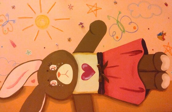
Title: Bunny After Playtime
Size: 61 cm x 91 cm
Medium: Acrylic Painting
Completed September 2023
Size: 61 cm x 91 cm
Medium: Acrylic Painting
Completed September 2023
- Exhibition Text -
Bunny After Playtime is an acrylic painting meant to represent the abandonment of childhood and while people grow there are still lingering aspects from them as a child that aren't as easily forgotten. Taking inspiration from PQhaus and his ways of reflecting lost hope within childhood, as well as Morisot and Rockwell with somewhat similar subject matter. I wanted this piece to feel like the audience is seeing it from a child's perspective, bright and colorful with a feeling of happiness.
- Inspiration -

What happened to you by PQhaus, 2022
|
PQhaus' works center around acknowledging the human experience and the underlying emotions within. Many of his works for me allude to a sense of nostalgia and how much people differ from who they once were as children. Specifically What happened to you directly confronts an individual's younger self and who they became as adults. As children the world tells us we are able to be anything we set our mind to be, however when reality replaces dreams many of those possibilities no longer exist. PQhaus utilizes the composition of having a mirror reflecting each subject to demonstrate this concept. In my initial ideas I had wanted to emulate this use of reflection to demonstrate something similar, this can also be seen with my initial inspiration of The Psyche Mirror. I had also wanted to replicate the brighter colors seen within the reflection of the subjects younger selves, something I had thought would be able to emphasize the overall juvenile nature of my piece.
|

The Psyche Mirror by Morisot, 1876
|
Morisot utilized the impressionist style to create a variety of textures as well as delicate subjects. In this piece a young girl is looking at her reflection in what is most likely her room. Like PQhaus I picked this piece as inspiration because the use of reflection was something that interested me. This piece almost blends into everything, the subject sharing similar colors with the background. While the background itself is lacking an abundant amount of detail I thought the use/lack of definition was something I wanted to replicate. The lack of definition from the subject and it's background is reminiscent of looking at old memories, something that I feel is most common with positive memories.
Little Girl Looking Downstairs at Christmas Party by Rockwell shows a little girl on the top of the stair looking down onto a bustling party. While there isn't a clear direction to specifically look onto the girl, the use of darker color in comparison to those downstairs at the party guides the audience towards her. The use of warm yellow tones also makes the events going on downstairs seem dreamy and perfect, similar to Morisot the people seem to be blending into one another/their background. I wanted to emulate this piece's use of tone. |

Little Girl Looking Downstairs at Christmas Party by Rockwell, 1964
|
- Planning & Experimentation -
My planning was separated into two phases, this is due to the fact that my first initial process sketches were not able to properly demonstrate the ideas I had in my head.

|
My first planning phase included similar subjects to both PQhaus as well as Morisot. When I had envisioned what would be able to properly show the grace and maturity that comes with aging I had thought of a ballerina. This would also have been able to push an air of femininity within my piece as well. When sketching the subjects for this piece I had envisioned having an abandoned doll in the foreground while utilizing a reflection to show the older more elegant subject.
This would have been a more direct way to demonstrate my messaging, however when moving onto overall composition I had difficulties with how to show that the image as a reflection. Similarly I felt like this initial idea seemed too clean and I knew I would have difficulties creating a stylized person. I also didn't think that the poses I sketched out would have been able to be properly transferred onto my canvas without looking properly integrated. |

|
Deciding to experiment with a different subject as well as composition made it easier for me to gain direct reference. I wanted to maintain remnants from my initial idea, so I still decided to keep the 'abandoned' aspect of a toy. To make it more personal I decided to have the new subject be a stuffed animal I have had since I was a child, this also allowed me to pose the stuffed animal in proposed ways to see how things like shadow would look. I posed the stuffed animal in different ways, that way I would be more confident in my subject and how it would look in my piece.

|

|


|
Since I wanted to emphasize youth I decided to make the pieces setting a child's bedroom, bright walls with messily drawn doodles in crayon where they shouldn't be. I sketched out some drawings that I could imagine a child drawing utilizing oil pastel, I did this because oil pastel has a similar texture to crayon (something children commonly use to draw on their walls) while being a brighter color.
After I created one final concept sketch that I was satisfied with, this would later be used to transfer onto my canvas. Somewhat similar to Morisot, I intended to have the overall background almost blend into the subject however I still wanted it to contain a decent amount of detail as well. Additionally, while I wanted my work to be somewhat realistic I wanted it to appear to be in the eyes of a child. By adding excessive detail where there normally wouldn't be (like adding extra detail to the stuffed animals eyes or exaggerating its expression) I was able to achieve this. |

|
- Process -

|
For my process I first painted the base of my painting, using a pink and pink-orange color scheme. I wanted the floor to emulate a carpet while not utilizing a heavy amount of texture, so I made the backgrounds lines not 100% straight, however the majority of these would be covered by the subject. I then projected the final concept sketch from my planing phase and used that to map out where the subject would be placed.
I wanted my painting to have heavy pink/warm tones to emulate Rockwell's illustration so I made the subjects fur a red brown and focused on having the clothing be varying shades of pink. This phase of my process was in order for me to get the base colors onto the canvas and see how the color pallet interacted with each other. |


|
After adding the base colors I started to shade in the bottom of the subject to give at least somewhat definition, this is similar to the darker shades Rockwell uses to bring attention to the main subject. Since I had also wanted this piece to be somewhat interactive I had also added 3D aspects like a bow on the rabbits dress. I had also used oil pastel to make drawings similar to ones you would find on a young child's wall, also incorporating youthful.cartoon-ish stickers within the background.

|

A closeup on the pieces background
|
|
Finally I added more detail on the rabbits dress, face, and body. Since I didn't want it to be 100% realistic I had added cartoon/overly exaggerated eyes to the subject. I did this by packing the eyes full of detail, using different shades of pink as well as glitter and varying sizes of gemstones. This allowed the subject to become more exaggerated and childish, similar to PQHaus' younger versions of the works subjects. All of these aspects gave the painting a realistic appearance while also looking like the audience if viewing it from a child's perspective.
|

|
- Critique -


Similarities:
-My piece shares a similar warm hue with Rockwell's illustration. Overall utilizing more warm tones to show a welcoming/bright atmosphere. Rockwell utilizes a yellow tone to symbolize the glowing party light of a bustling event, whereas my piece uses more pink tones to demonstrate the girlish nostalgia of an abandoned toy.
-Similar to Morisot I don't utilize a heavy use of definition/contrast. The contrast that is used within my piece is very little, only used for some shading. This can also be seen within Morisot's own subject, specifically within the subjects reflection to further emphasize that aspect.
-Similar to Morisot I don't utilize a heavy use of definition/contrast. The contrast that is used within my piece is very little, only used for some shading. This can also be seen within Morisot's own subject, specifically within the subjects reflection to further emphasize that aspect.
Differences:
-Each inspiration focuses the majority of the attention onto their subjects, leaving their background with less detail. In the case of PQhaus and Morisot the backgrounds are barely eligible or full of empty space. Conversely I wanted my piece's background to be full of detail as well, looking like a wall that has been covered with childish doodles. This is also aided by my use of oil pastel to replicate the texture of a crayon.
-Each work utilizes a human subject to keep the work more realistic, this is also to reflect the individual messaging as well. PQhaus wanted to empathize with the human experience of abandoning childhood dreams, while Rockwell wanted to show the desire to be grown. Conversely I used an inanimate subject in order to to show an aspect of my overall message (instead of being direct).
-Each work utilizes a human subject to keep the work more realistic, this is also to reflect the individual messaging as well. PQhaus wanted to empathize with the human experience of abandoning childhood dreams, while Rockwell wanted to show the desire to be grown. Conversely I used an inanimate subject in order to to show an aspect of my overall message (instead of being direct).
- Reflection -
I enjoyed this piece because I was able to be more stylized with the overall outcome. The overall message and inspiration allowed me to be more chaotic with my process as well. Incorporating 3D aspects also added more definition and activity into the final piece, something that I enjoy doing within my work. I enjoy working with brighter colors while incorporating a cartoon-like appearance and this piece allowed me to heavily reference this. When initially planning for this piece I had some difficulty with establishing how I had wanted to convey my message, but once I was able to focus on a non-human subject it was easier to begin the final product, using bright colors and abundant add-ons assisted with this as well.
- Connections to the ACT -
1) Clearly explain how you were able to identify the cause effect relationship between your inspiration and its effect on your art?
When viewing my inspiration I was heavily influenced during the first phase of my planning. I wanted to incorporate a similar use of reflection as well as definition. The use of nostalgia as well as children from both PQhaus and Rockwell influenced me to make my piece more nostalgia filled additionally.
2) What is the overall approach the author has regarding the topic of your inspiration?
There are similarities most closely to Rockwell's illustration. This is due to overall warm tone, similarly the use of a direct/forward perspective follows close to both Morisot and Rockwell (excluding the use of reflection within Morisot's work).
3) What kind of generalizations and conclusions have you discovered about people, ideas, cultures etc. while you researched your inspiration?
I was able to learn more about how different artists can convey different types of longing/monotony of life and growing up. Both Rockwell and PQhaus can be seen as showing a longing of growing up (Rockwell) or a longing of what could have been (PQhaus). Similarly there is a demonstration of the commonality of life as seen with Morisot.
4) What was the central idea or theme around your inspirational research?
I wanted to find inspirations that were fueled with a sense of nostalgia and longing. Works that were filled with a haze of positivity as well as a somewhat happy tone. I wanted the works to show how the process of growing/abandoning certain aspects of who you are is inevitable but doesn't have to be negative.
5) What kinds of inferences did you make while reading your research?
How growth can be shown within works of art and how things like desire/longing can cover similar topics but can represent different things.
- Citations -
“Little Girl Norman Rockwell - Google Search.” Www.google.com, www.google.com/search?q=little+girl+norman+rockwell&rlz=1CAQMZZ_enUS1035&oq=little+girl+norman+rockwell&aqs=chrome..69i57.6021j0j7&sourceid=chrome&ie=UTF-8&safe=active&ssui=on#:~:text=(%237)%20Norman%20Rockwell.
“The Psyche Mirror.” Museo Nacional Thyssen-Bornemisza, www.museothyssen.org/en/collection/artists/morisot-berthe/psyche-mirror.
““What Happened to You?” | Gallery.” PQHAUS, www.pqhaus.com/gallerypqhaus?pgid=l25jjs7j-ae99377f-a937-40f1-9626-9f7a5793a48d.
“The Psyche Mirror.” Museo Nacional Thyssen-Bornemisza, www.museothyssen.org/en/collection/artists/morisot-berthe/psyche-mirror.
““What Happened to You?” | Gallery.” PQHAUS, www.pqhaus.com/gallerypqhaus?pgid=l25jjs7j-ae99377f-a937-40f1-9626-9f7a5793a48d.
